How to Design a Stunning Magazine Cover (with Examples)
Jun 7th, 2022 by Chloe Laursen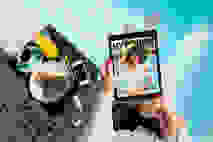
Magazines have become a staple in everyday life, with approximately 220 million people reading them every year in the U.S. alone. Whether you’re checking out at a grocery store or waiting in a lobby, there are always magazines in sight. But, like nearly everything else these days, consumption is shifting in favor of digital options. Revenue in the Digital Newspapers & Magazines segment is projected to reach $39 billion this year. Even without the task of printing, however, the amount of work that goes into designing and producing digital magazines is no small feat.
While many people don’t realize just how much sweat goes into the creation of a magazine, we understand and appreciate the hours upon hours of tedious planning, editing, writing, and designing behind each and every page. At Issuu, we believe that hard work pays off… and the key to growing your audience is by having a strong first impression with the front cover. This begs the question, “How do I design a magazine cover?” Here, we will share our wisdom and tips for how to design a stunning magazine cover to make your newest edition stand out, getting it off the digital shelf and into the right hands.
Incorporating Key Elements of a Magazine Cover
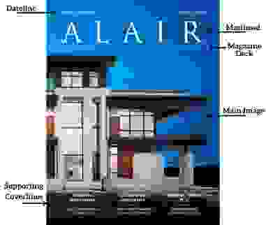
Before we dive into the do’s and don'ts of designing your cover, it’s important to understand the elements that make up a magazine cover and some common terminology. Arguably most crucial is the masthead, which is the giant title of your publication; “Vogue” and “The New Yorker” quickly come to mind as stand-out mastheads. Typically sitting near the top of the magazine in big, bold letters, the masthead serves as your emblem — think of it as your logo, if you will — and it deserves the spotlight.
Just as you picture a red bullseye when thinking of the store Target, you want your audience to picture your masthead when thinking of your magazine. Next, there is your main image. This is what will captivate and intrigue your readers to pick up (or, click) the magazine, so spend time to make this the best it can be. Also on the cover lie the magazine deck, lead articleline, and supporting coverlines. These give readers a clue as to what they can find inside the magazine, and are best when they are clear and succinct. A cover should also feature the issue and dateline, and this is likely where the barcode will go if your magazine includes one. (For online magazines, our digital sales feature simply gates your publication and prompts readers to purchase in order to unlock; no barcode is necessary.) See how all of these items come together in a magazine cover design:
Now that we’ve covered the essential elements of a magazine cover, let’s move on to the fun part and learn what you should do to make your magazine cover the best it can be.
Defining Your Brand with the Masthead
A masthead is meant to be big, bold, and proud. It is symbolic of your magazine and should be the mental image anyone draws up when thinking of you. Consistency is a must here, so make sure you love the font, positioning, and general look of the masthead before you commit to it.
Fonts come in a vast array, and the options here are limitless. Opt for a sleek, thinner font for your modern or whimsical magazine, a bold and bulky font for your statement magazine, or a script and cursive-esque font for your thoughtfully designed, artistic magazine. Like a kid in a candy shop, there are endless font websites you can get lost in — so have fun sampling fonts until you fall in love. Or, if you have some inspiration you’re hoping to mirror, Adobe’s Indesign has compiled a list of famous magazine fonts and their doppelgangers.
The font should be bold enough that it’s easy to read no matter the background, as your design and main image will shift from issue to issue. Once you’ve settled on your ideal masthead, you’ll have the timeless emblem that is your magazine. A masthead should stay constant across issues, with the same font, sizing, and position, but the color can be changed; enjoy the excitement of adjusting the color of the masthead in various issues to beautifully tie everything together.
Here are some magazine cover examples with Mastheads we love, which are great examples when looking for ideas for a magazine cover:
Setting the Right Tone
Have you ever had an unpleasant experience at airport security? It probably set the tone for the whole flight, later to be completed with a crying baby and a spilled water. Or has a hostess ever complimented your outfit while you wait to be seated? Your dinner is already off to a great start, followed by food that tastes amazing and music playing at the perfect volume. A tone is set almost immediately, and people are creatures of reaffirmation, so it’s important to get it right.
It is much easier to carry on a tone than try to change it after a night has already begun or the airport security line has already put you into an irritable mood. A cover is the frontline for setting the tone of the magazine. Utilize it to curate the experience you desire for your readers. If your magazine is light-hearted and humorous, use your cover to depict that. Maybe this issue is more serious; allow the cover to set your audience into this mood before reading. Whatever tone you desire or emotion you hope to evoke inside the magazine, it should be set with the cover.
1. Main Image
The main image is the perfect way to do this. Photos do a particularly good job at stirring emotions, so give the process of choosing a main image the time it deserves. If your photo is of a person, eye contact is always impactful. Eye contact invites a sense of connection with the photo, and can effortlessly lead viewers to think about what the image is trying to say. This slightly deeper reflection is beneficial to you, as your audience is now already invested and about ready to flip the page to find out more. It draws the eye and locks in the gaze, and is an easy tactic to design a powerful, stunning cover.
Your photo should be clean and professional, with an obvious focus point the viewer is drawn to. Whether this is eye contact or not, it is important to have one feature point that commands attention, with the rest of the cover designed around this. You can accentuate the feature point and guide people to where you want them to look by using edits like contrast and leading lines.
Always remember to cut out busyness and keep it simple, allowing you to easily establish the tone without viewers being distracted by a bustling background. If your photo does have a busy background and you have permission to edit, play around with blurring and cropping until the photo gives you exactly what you need from it. Setting the tone of the magazine goes hand-in-hand with representing what’s inside, so your cover and main image should be a preview of the content within.
2. Color
Along with the main image, colors are your friend when it comes to setting a tone. Different colors can drum up different emotions, and there are lots of quick reads on color theory and color psychology that are helpful to look into before starting your magazine cover design. Colors look slightly different in print versus online, so consider how your magazine will be distributed when choosing color values. If you aren’t sure what colors go well together or simply don’t have the time and resources to spend hours on color themes, there are plenty of free color palette generators to do the work for you.
Looking at examples is a perfect place to start when trying to answer the question, “how do I design a magazine cover?” Check out these magazine cover examples, which do a great job using images and color to set the tone.
Perfecting the Finishing Touches
1. Coverlines and Important Information
Now that the tone is set, your main image is powerful and eye-catching, and your masthead is perfectly prominent, it’s time for the important information and detail. Your cover is representative of what’s inside, so get ready to direct viewers there. Add in a lead article line and, if you so desire, some supporting coverlines to give the audience an even clearer idea of what is waiting for them inside.
These bursts of text should be short, clear, and succinct, and are best with a few key, popping words. A page number next to each of these will invite your reader to go straight to the main attraction — and publishing on Issuu allows you to link the coverlines with the corresponding page, bringing readers from the cover to the featured stories with only a click. To ensure your reader knows that this is a new issue they simply need to have, include the issue and dateline. This is standard protocol in magazine cover design.
2. The Art of Balance
You’ve just added a few text blurbs and words here and there, now you need to ensure that there is balance. Play around with the design by moving pieces to different areas on the page. Is one side too text heavy? Does one area have too much or too little of one color? Balance is key, and while everyone has personal preferences, remember that you want your cover design to be visually appealing to the majority of your target audience. Some people may have trouble reading words that are squished together or condensed to one area; others may get distracted by elements strewn all over the place.
The font of these informational texts will be fairly small to keep that focal point of the image the center of attention; it shouldn’t be fighting with a date or page number. Always trust your gut but there’s no need to just eye-ball it, let grids and rulers lend a hand during this arrangement stage. Gather some feedback, make a few versions with slight variations, and there you have it, your stunning magazine cover.
Magazine Cover Examples and Publishing
It’s time to put all of this new knowledge to work. Browse through the content published on Issuu for inspiration or jump right in and bring to life your ideas for a magazine cover. We love creating designs on Indesign and Canva, and Issuu even offers integrations to streamline the creation-to-publication process. You’ve already put in the hard work of creating a magazine, so why make digital publishing harder than it needs to be? Once you're done creating, feel free to upload to Issuu to take advantage of our article and visual stories features and share your magazine across all channels. It’s easy to sell your publication with our digital sales feature, too, and let us take care of all of your sales and payment logistics, without a commission.
Let your magazine be seen by more readers — join Issuu today and take advantage of our Magazine Creator to share your stunning cover with the world.